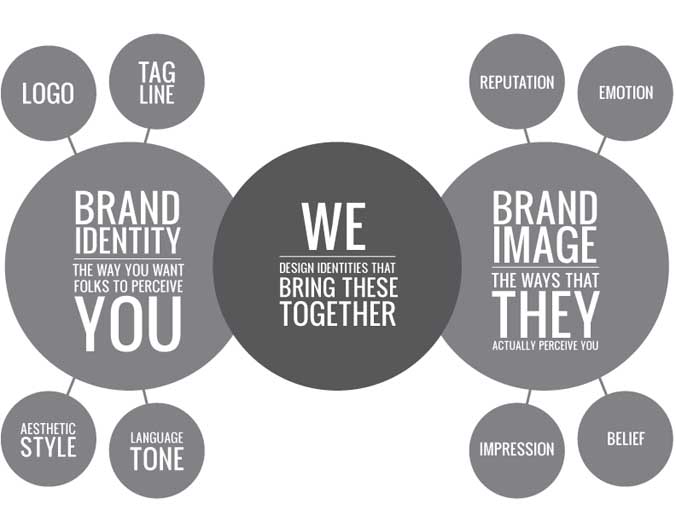
Let’s get a few things straight: your logo and your website is not your brand. Your brand is a culmination of the experience, perception and reputation that people have of your services. Branding is the action taken to build your brand (strategy). And a brand identity is the tangible expression of your brand (logo, typography, colors, etc).
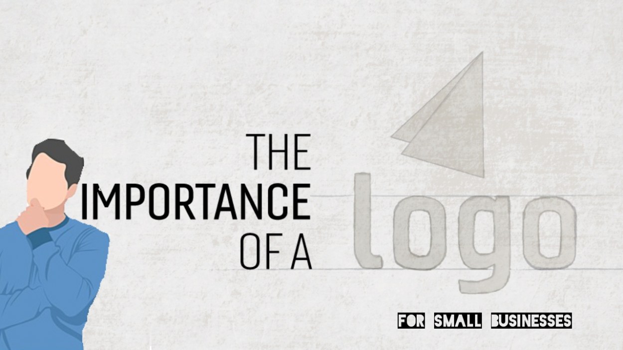
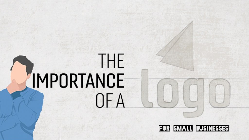
But that said, your logo is important to your business because it communicates ownership, quality, and values. It’s imprinted on your products, your business card, website, social media, and most importantly, in the minds of your clients.SEM keywords are words and phrases describing your product or service that you choose to help determine when and where your ad will be displayed in search engine results. In paid search, you’re paying Google (or other search engines) to show your search ads when someone enters a relevant keyword.
Your logo is likely to be one of the first interactions people have with your company and it’s your opportunity to make a solid first impression, show you deliver a quality service, and visually express your purpose.
WHAT ARE THE VARIOUS TYPES OF LOGOS
The term “logo” generally refers to all the marks that represent your brand. There are five different kinds of logos. A wordmark that compromises a standalone word or words like FedEx or Coca-Cola. A lettermark that contains only one letter or an abbreviation: Think of the two C’s for Chanel or the A for Adobe. There is a logomark that contains a symbol only: Think the Nike swoosh or the apple for Mac products.
Then there is an emblem: that is a wordmark, lettermark, or logomark within a shape that is essential to the design: Harley-Davidson Motor Cycles or the NHL logo are good examples of this. The final type is the combination mark which contains a symbol + wordmark or letter + logomark.
Since Design Powers a small business and doesn’t have instant brand recognition, i designed my business logo as a combination mark. It allows for an icon to be used in social media and favicons and the wordmark to be used everywhere else.

WHAT MAKES A GOOD LOGO
A good logo is one that aligns and feels appropriate to your industry or service. If you’re a professional services business vs. a product usually simpler is better. We often design wordmarks or typographical logos for clients because that is all they really need. It’s designed in such a way to differentiate you from everyone else and fosters brand loyalty. How? It has meaning built within it. Why? Because your businesses’ belief system, core values, purpose, mission, and vision are what your brand is built around. It’s what people remember and tells their friends about; not your logo.
No one really cares about your logo (except for graphic designers, or those with an eye for design). What people really care about is their experience with your service and what your brand is advocating. Good design not only looks professional on the surface, but it also signifies something deeper.
WHY DOES YOUR BUSINESS NEED A GOOD LOGO
A well-designed logo builds trust by validating your professionalism and get’s people to stick around. It tells potential clients who you are, what you do, and how that benefits them. It communicates to people with no prior knowledge or experience with your business that you do great work. If your logo looks unprofessional, people will undoubtedly question how well you’re able to deliver your products and services. Have you ever hit the back button or chose one company over another simply because they look more legit? People make snap judgments and poor design makes people leave.Create a strong logo to stand out to consumers, ensure they remember your brand, and cultivate positive associations with you. Logos have a deep symbolic association connected to people’s memories and emotions. Let’s take a quick look at Nike for example. The swoosh is just a swoosh. But, the connection we have to that symbol has everything to do with their vision of making the world a better place through running. That powerful idea defined their brand and their logo communicates that, empowering their business to thrive. Over time and with lots of consistent brand marketing, your logo should do the same for your business..
Invest in your logo design. It’s what matters most for increasing your credibility and pulling consumers in.
HOW DO YOU CREATE A GOOD LOGO
A small business logo needs to be clear and easy to interpret to quickly connect with your audience. It’s important to keep your logo simple so it works across multiple media platforms and is effective at any size.Unlike large companies, most small brands don’t have years of brand recognition that people associate your business with or a huge marketing budget to help consumers understand what your business does. So, your logo needs to clearly communicate who you are and what you do in an instant. From concept to roll-out, there’s much to consider when boiling your brand to a single mark. However, a great small business logo only needs three things: great typography, simple colors, and a strong visual element. Check out our logos designs – most tend towards simplicity and bold colors but not all.
CHOOSE A TYPOGRAPHY THAT REPRESENTS YOUR VALUES
The selection of typefaces and how they are arranged is as important as the use of color, images, or graphics in creating a logo and brand. Why? Because people associate the way a word looks with what a word actually says to determine how they feel. Strong branding provokes emotional connection. You want your typography to strike interest, promote trust, and encourage optimism. Typography is a way
stir up such feelings without people even being actively aware of it. Typography is used to communicate the tone of voice and personality. Pick typography that reflects what your company stands for—whether it’s elegant, traditional, whimsical, modern. Similar to furniture, typography should be aesthetically pleasing and functional at the same time. Your choice of typography matters because it impacts user experience. Make sure your company name is clear and legible. Consider how your logo will be used: your logo could appear on screens, business cards, letterheads, signage, and packaging just to name a few. It needs to be readable from a distance and up close. And if your logo has a graphic element make sure your typography is in balance with the icon.
Ask yourself, does my typography achieve an effective level of representation, communication, and visual appeal? If your answer wasn’t a definite yes, it may be time for a rebrand.
Pick colors wisely
The color of your logo will determine how it is perceived and has the power to drive purchasing decisions. Color triggers emotions and gives meaning. And when used consistently across your marketing, color improves brand recognition by up to 80%. The right colors depend on your industry and target market. You probably noticed that certain industries stick with certain colors. For example, financial institutions tend to use blues because blue communicates security and reliability. Brands use blue to promote trust in their products and services. Pick your color(s) based on the feelings you want consumers to experience and the actions you want them to take. Take into consideration human psychology, culture, trends, and context. Your brand color should tell a story. It should communicate your values and be unique enough to not be confused with others in your space.
The most powerful brands stick to a simple color palette of less than three main colors. They also use solid colors rather than gradients. Keep in mind color looks different on screen and in print. Make sure you can reproduce your colors accurately (Pantone, CMYK, RGB, Hex).
Use a simple iconic element
Although 72% of the best brand names are made up of words or acronyms, those names create an image in someone’s mind using typography. The same can be done with graphic elements, symbols, and icons. A visual element adds interest and makes your logo memorable. It has to grab the attention of a consumer for 10 seconds so they can memorize it and form an opinion about it. Some designers create this by modifying text or adding an illustrated icon that can be used on its own in certain situations. Make sure all the artwork is original and not from clip art. Over time and with consistent use, a visual association will develop.Your logo is the visual foundation of your brand identity
Design matters and you do need it! Especially if you want people to give you money and tell the world about you. When you invest in your branding, you empower your small business to thrive.
Have a question about branding or logo design? Write a comment below! Need a professional logo designed for your small biz? Get in touch. View some of our logo designs here.